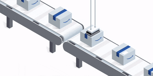
Amazon’s fulfillment technologies
a tool that can facilitate any warehouse operations
Role
UX Designer
duration
3 months
Date
Sept. 2017
One of the biggest bottlenecks in Amazon fulfillment centers have always been complex manual processes. FISH which stands for Form Interpreter and Storage Handler is a type of app that was created to help facilitate these processes and allow for users to quickly go through checklists, log information, scan badges, and complete complex operation workflows accurately with more efficiency. Despite the success of hundreds of FISH apps, there are still too many variations of these workflows for all the Amazon fulfillment centers around the world for the development of these apps to keep up.
By allowing anyone to create and modify FISH apps, warehouse associates who are experts at their work will be empowered to independently create FISH apps for their workflows and allow their teams to operate at the highest efficiency.
This project was a design team lead initiative to explore new solutions for this ambiguous problem. I was the lead UX designer responsible for setting the direction for this new product and driving the needed research efforts.
On the research side I consulted with a team of researchers and executed interviews, observational studies, and testing sessions with Amazon fulfillment center associates from all around the world. On the design side I had 2 software engineer consultants who helped with feasibility and scoping.
Before I started on this project an engineering intern actually built a working FISH builder tool that unfortunately nobody was using. I started by carrying out an heuristic evaluation of this existing tool and reached out to anyone who may have used it before for interviews.
An Heuristic Evaluation
Gathering my stakeholders I ran an heuristic evaluation around these main tasks:
Out of the 4 of us, I was the only one who was able to complete these tasks because I was the only one with prior knowledge in how FISH apps were coded. So in addition to inconsistencies, errors, and cognitive overload issues across the tool, it also heavily relied on a user’s prior experience with coding.
Shortly after the heuristic evaluation I was able to track down two beta users in Amazon’s Luxembourg office who have actually used this tool before. After an interview with them the overwhelming response was:
“This tool is not intuitive enough for a beginner user to create FISH apps alone and not flexible enough for an expert user to want to use it over coding a FISH app from scratch due to its constraints.”
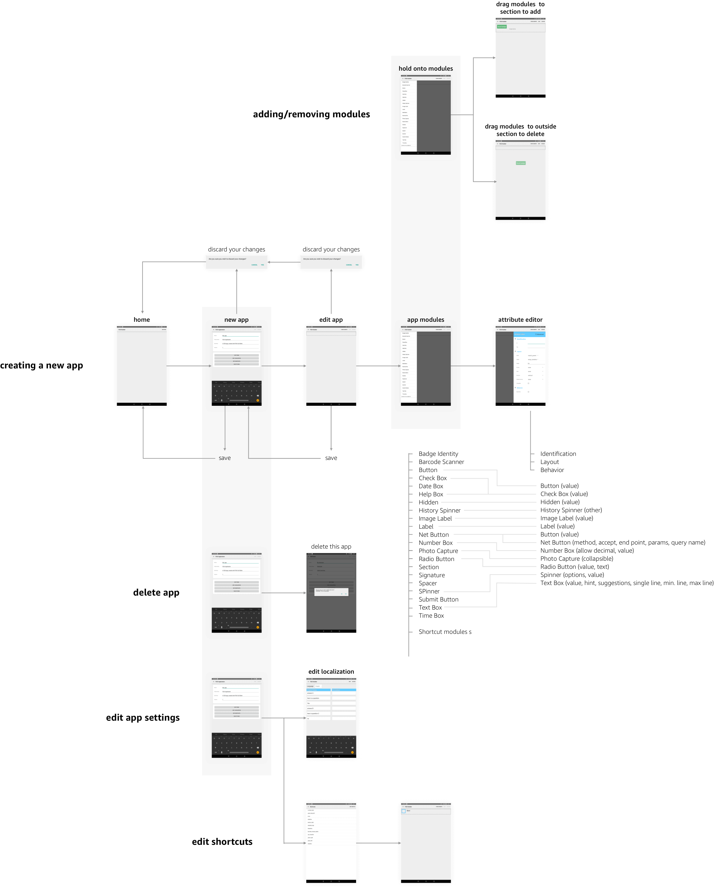
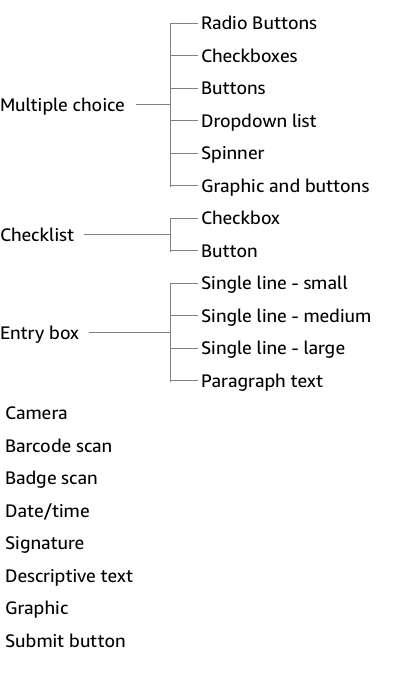
To address the issues with cognitive overload in the beta tool, I started by doing an audit of every single function and module a FISH app can include. I then conducted a series of card sorting exercises with FISH app users and creators I recruited, who were experts in this area, to categorize these modules and brainstorm ideas for new ones. After pooling together the results I was able to create an intuitive and scalable hierarchy for grouping these module options.
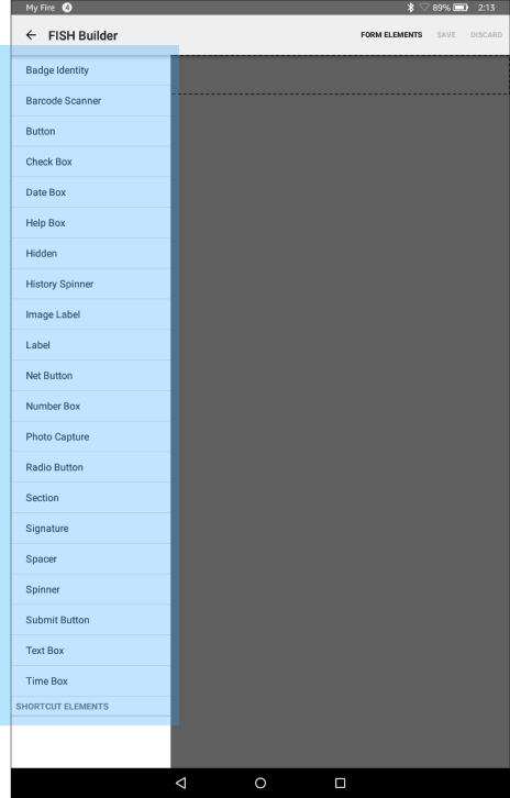
I was able to reduce the overwhelming 22 module options users are faced with upfront to just 11 options. 22 modules were still available but they were simply grouped and hidden a layer deeper in a module’s style and behavioral settings.
Beta app module options:
Proposed module options:
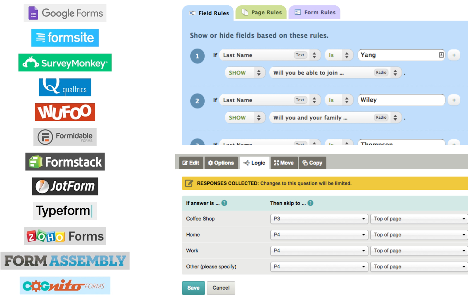
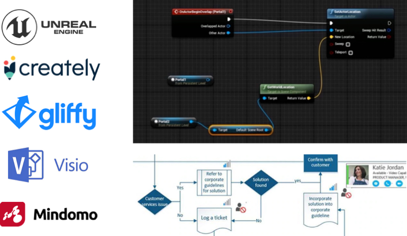
A FISH app is made up of questions, instructions, and tasks so naturally there are a lot of parallels that can be drawn between this builder and common form builder tools. They both share a series of steps and offer the ability to create logic branches. To avoid reinventing the wheel, I decided to start by taking inspirations from common form builders.
I created 3 prototypes that demonstrated 3 different approaches commonly used among the most popular form builder tools.
1
2
3
Concept 1 - A word based design that presents logic branching through descriptive text
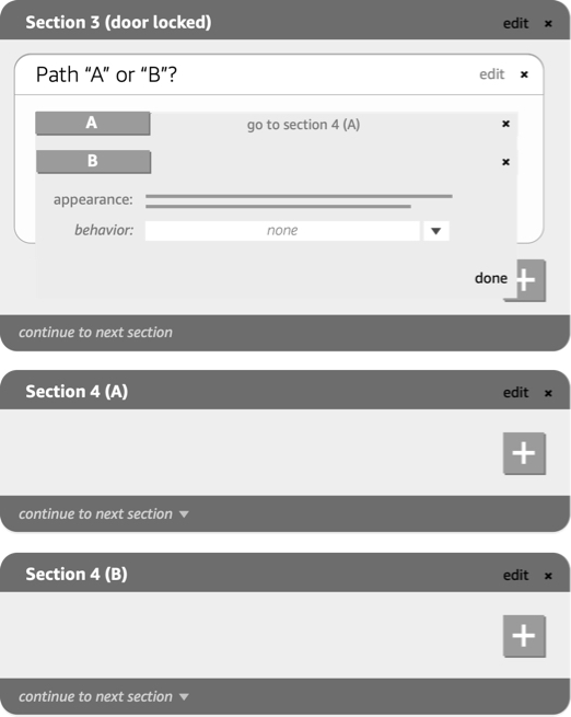
Concept 2 - Visually representing logic branching by nesting steps within a workflow
Concept 3 - Another way to visually represent logic branching by having stacked cards that act like forks in the road within a workflow
Main takeaways
Due to the highly complex logic branching that can often occur within FISH apps, most participants preferred the visual approaches to representing the workflows over the textual ones. Concept 2 and 3 where logic branching was visualized by nesting or stacking of modules were most favored by the participants.
Overall, participants were very underwhelmed. Although these methods of visualizing the builder was now more intuitive and a great improvements from the initial beta version, the design was still not optimized for the extreme complexities a FISH app often times have.
Through a series of semistructured observational studies I asked participants to go through the process of creating a FISH app for a simple warehouse workflow from scratch. Every participant shared a very similar process and their pain points and struggles became very clear.
Developing and quality assurance are typically the two steps that take the longest in this process often requiring many cycles and this was the biggest obstacle for anyone trying to make a FISH app.
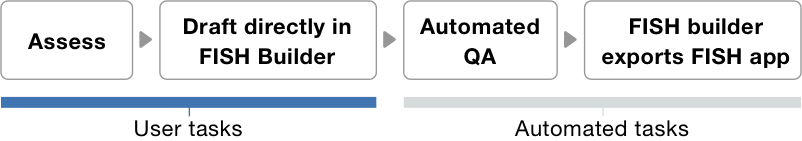
In an alignment meeting with my stakeholders and tech partners I proposed a new mission for FISH builder. The goal was to make the UI of FISH builder so visually similar to how a user would draft up a FISH app on a whiteboard, that the process of drafting the app became the actual process of building the app too. We can then automate the QA process and catch errors and loose ends before the app was exported.
Reducing user effort
With this highly visual builder design approach it was important for the the UI to not constrain our power users. Doing so will allow our beginner users to also feel empowered to build complex FISH apps and become power users over time. It would also allow for beginners users to easily make changes to a complex FISH app a power user may have created or reuse pieces like a template to create new apps.
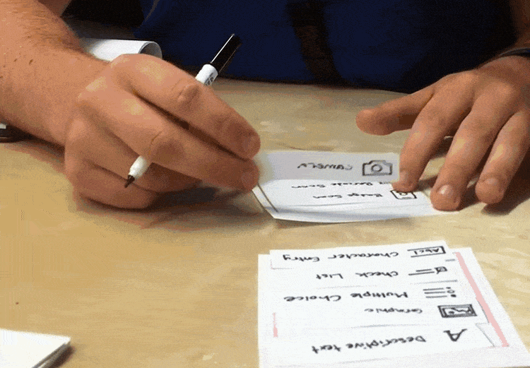
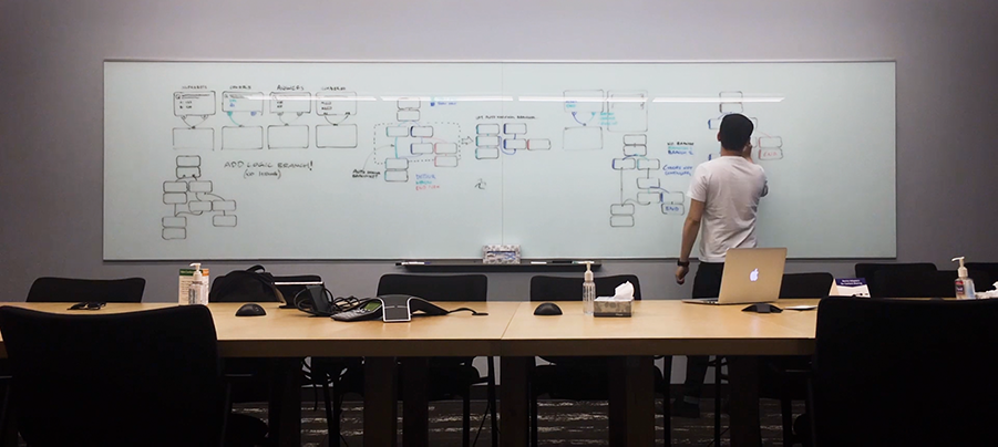
To ensure this approach of a highly visual builder was viable with both beginner and expert users, I began with a series of paper prototypes. These prototypes allowed me to iterate quickly at a low fidelity and test with participants in a way where they felt comfortable filling in the gaps within their imagination and added drawings.
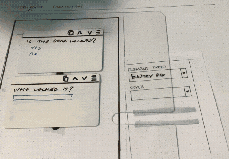
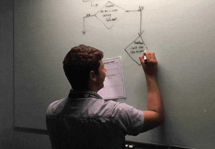
Using the design language and patterns from these common tools I began to do a lot of white-boarding and sketching. Through this process I began to narrow down on how FISH app workflows could best be visualized, how interactions and motions can leveraged, and how this framework would stretch when handling very complex workflows.
Low-fidelity prototypes
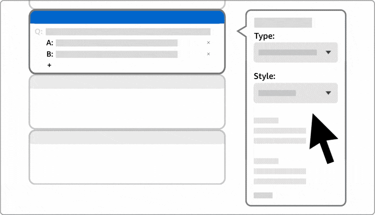
Using the results from the card sorting exercises, an intuitive toolbar and context menu was created. The module options are categorized into sections in the order of most commonly used to least. The number of options have also been minimized to allow users to quickly scan and start building their app. Once a module is created, users can then add content to that module in its card and set behavioral settings in its context menu.
1. Add modules
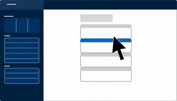
2. Add content to modules
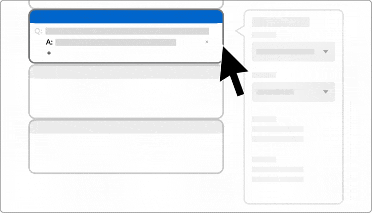
3. Set module behavior
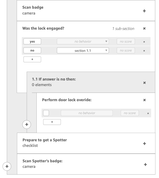
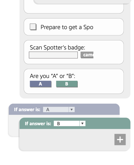
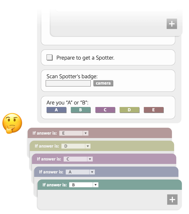
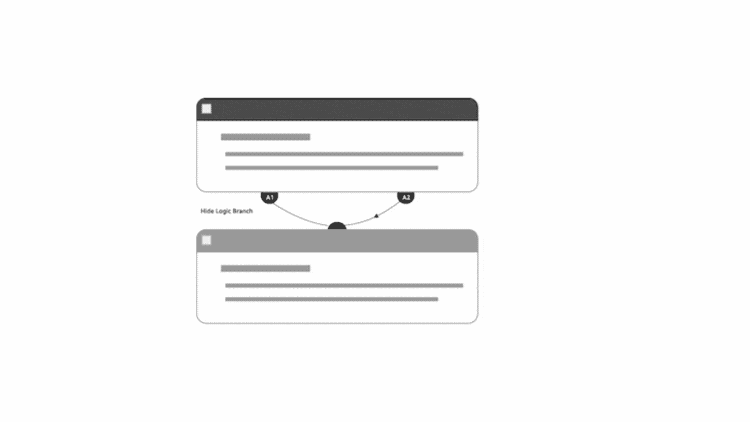
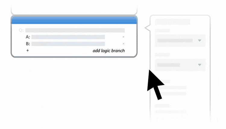
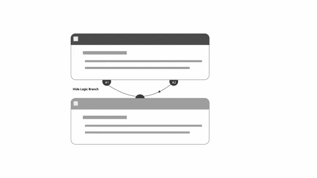
Complex logic branching made easy
For every option a step has, an additional node would be added to that module card. Nodes can be exposed when users want to add logic branching from these steps by either drawing lines to create connections between steps or create new routes in the workflow.
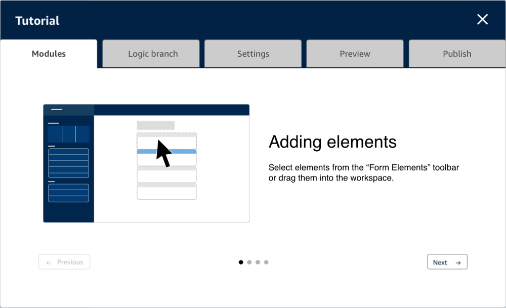
I conducted a final round of testing with an interactive prototype with beginner and expert users. An optional onboarding tutorial was also added to allow this final test to be as unmoderated as possible.
When participants decided to launch the onboarding tutorial pop-up, they can tap on a series of tabs for specific features to learn more. In each tab a short animation would demonstrate how that featured worked and this whole onboarding tutorial took users under 1 minute to walk through. Two participants out of five, who chose to skip the tutorial altogether were still able to complete all testing tasks with only a bit of hesitation.

This was finally the design approach that even the expert FISH app developers were excited about. They pointed out exactly what we were aiming to accomplish which was that building an app was now so simple, they would never even need to brainstorm and draft a workflow on paper first ever again.
The goal of the project was to enable every warehouse team member to create FISH apps without coding and the final rounds of user testing proved just that. My work ended up setting the direction for a new design and tech team to bring this product to fruition.
At this time the Amazon fulfillment Technology team was also in the process of establishing a thorough design system so many of these interactive card patterns and testing results ended up informing that initiative.
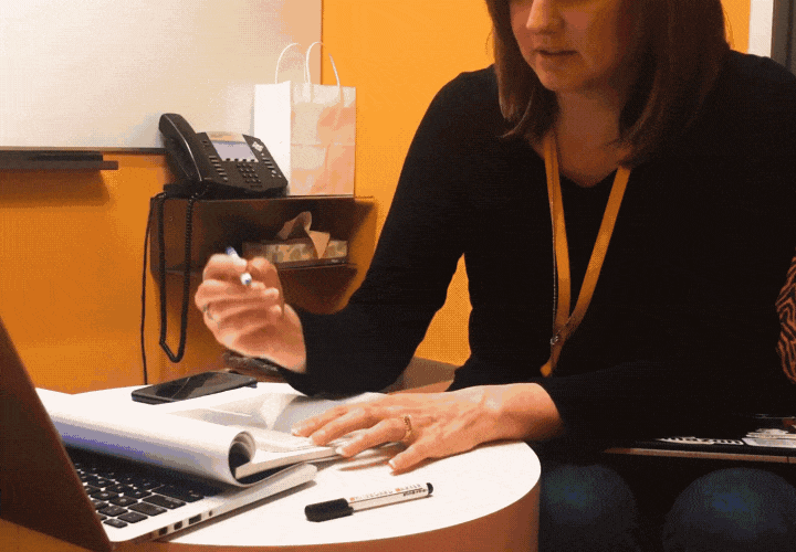
It was a great experience for me to drive the vision and definition of a new product that began as such an ambiguous idea. It was also the first time where observational and behavioral research played such a crucial part in my project. This project taught me a lot about working closely with my users and it was also a very eye opening experience to get to work in a few Amazon Fulfillment Centers for a few weeks to better understand their operations.
just a moment...